Portfolio
Paulina Bednarczyk
COMPANY BRANDING, LOGO DESIGN, WEBSITE DESIGN -
- RESPONSIVE PROJECT WITH FOCUS ON CERTAIN USER EXPERIENCE.
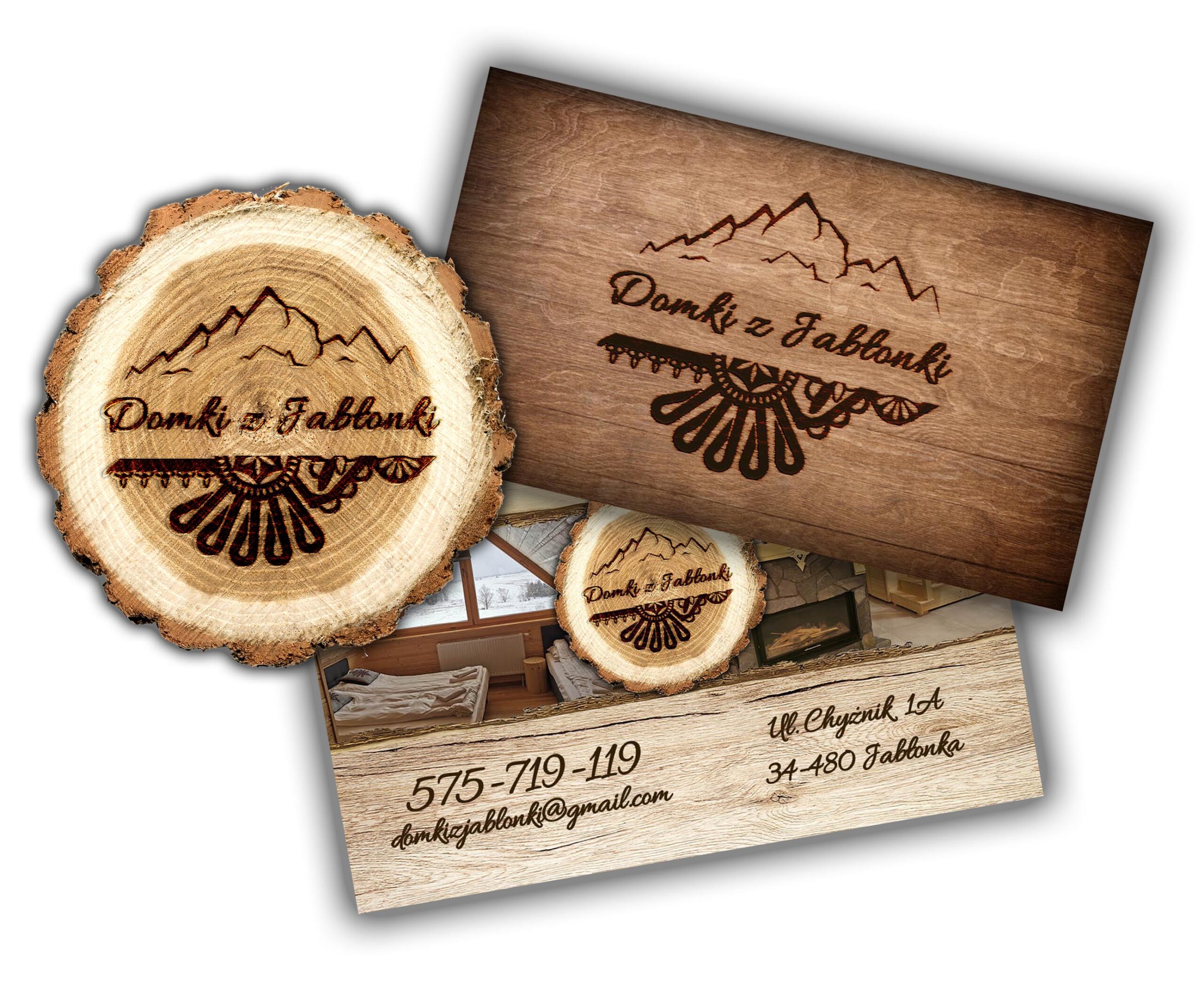
Logo Design
Before starting work on the logo, I had a detailed conversation with the owner of the company. We discussed all possible options and style they would like to go with. I provided 3 different mock ups that were my propositions for the logo. The owner requested couple of updates and modifications, after which we came to a final design.
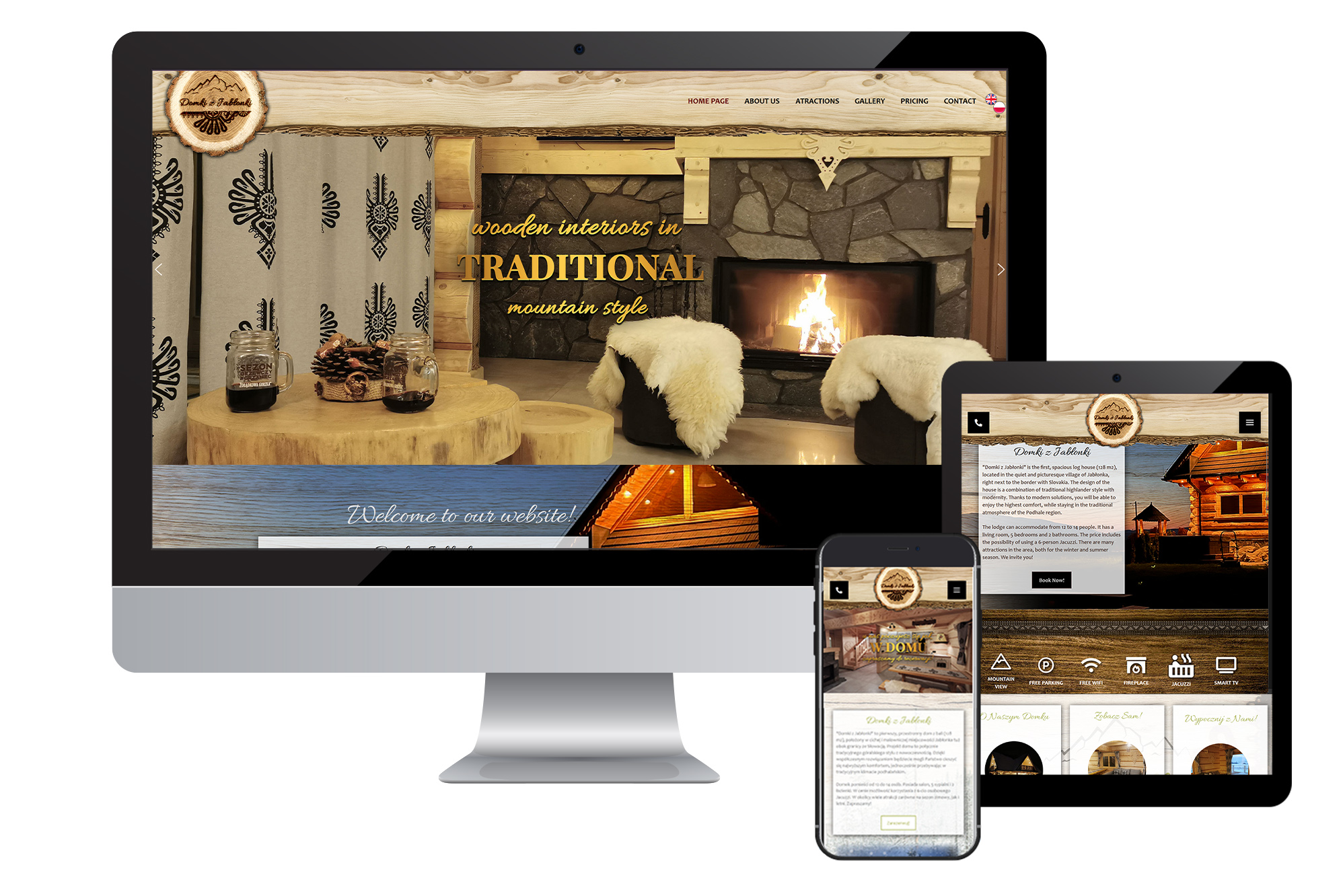
Web Design
Design of a website started after deep research of the current companies that have similar character. I made a chart where I pointed out strong and weak points of competitors, and together with the owner of the company, we figured out which way to go. I made a quick sketch of the website (a paper wireframe) which, after approval and discussion about style and colors, was converted into the final website design. I started with mobile design, because most of the users that were said to be the customers, find information on their phones, wishing to smoothly check actual offer and read more about the place they want to book. I created the website in Word Press builder, using Themeco ProTheme Theme. Despite the general up-sizing methid, I made a desktop version, which was smoothly resized to tablet and mobile version on the go, thanks to the theme features.
After finishing work on all subpages in the basic language (Polish) I created English version of the whole website.
Branding & Promotion
Creating united in style and form printable designs and social media content was the next step. I worked on multiple flyers, postcards, digital posters and social media posts.
LOGO DESIGN, WEBSITE DESIGN -
- RESPONSIVE PROJECT WITH FOCUS ON USER EXPERIENCE.
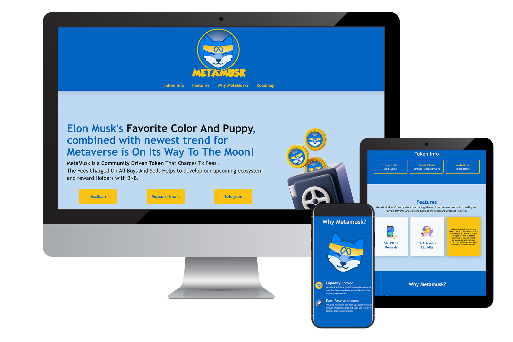
Logo Design
The owner of the company had a clear idea what does he want as a logo and how should it look like (color scheme, style and shape). I provided a couple of samples to see what direction should I choose while finalizing the design. After a few changes and updates, I created the final logo.
Web Design
Responsive website design was a key here. The owner wanted the website look simple and smooth on all screen sizes, focusing on the mobile screen. Most of the potential users were said to be mobile users, desktop was the second option, but also important. I received a list of websites with similar topic covered, so I made a plan and a chart, comparing their features and style. I summed up all research and provided the owner with digital wireframes and sketches of the layout and the general look. After couple of changes, I started working on the design - I also used Word Press platform and Themeco ProTheme Theme, so the work went soothly. The website contains only one main page, and has multiple anchor points to different parts of the content. Thanks to that, I only had to work on one page - I made a desktop version, which was smoothly resized to tablet and mobile version thanks to the theme features.
Graphic Design
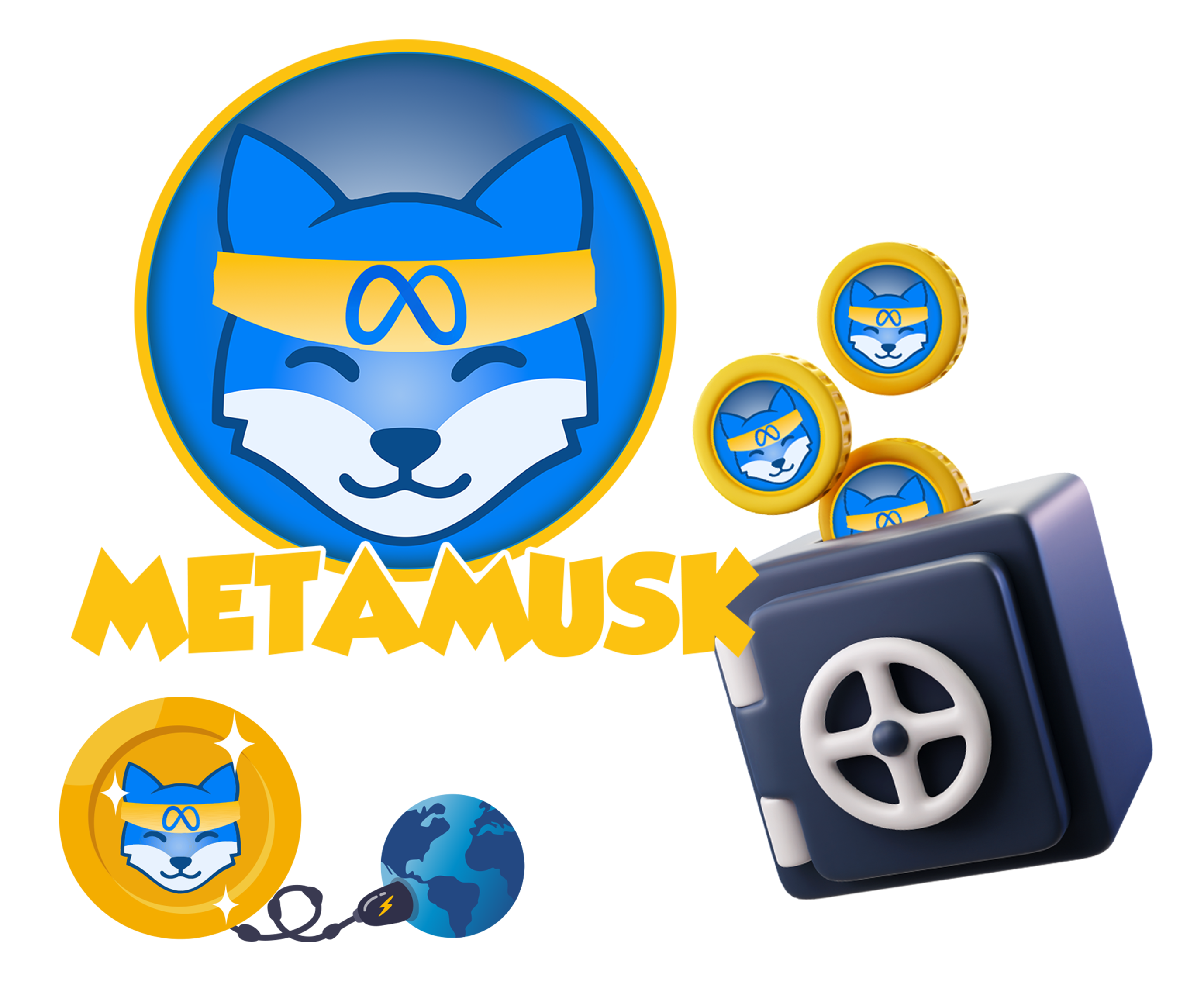
Website design required creation of custom graphic elements that were used on the website. I customized existing designs found online in libraries like Adobe Stock or Freepik. I added and connected elements that the owner requested and wanted to implement to a website.
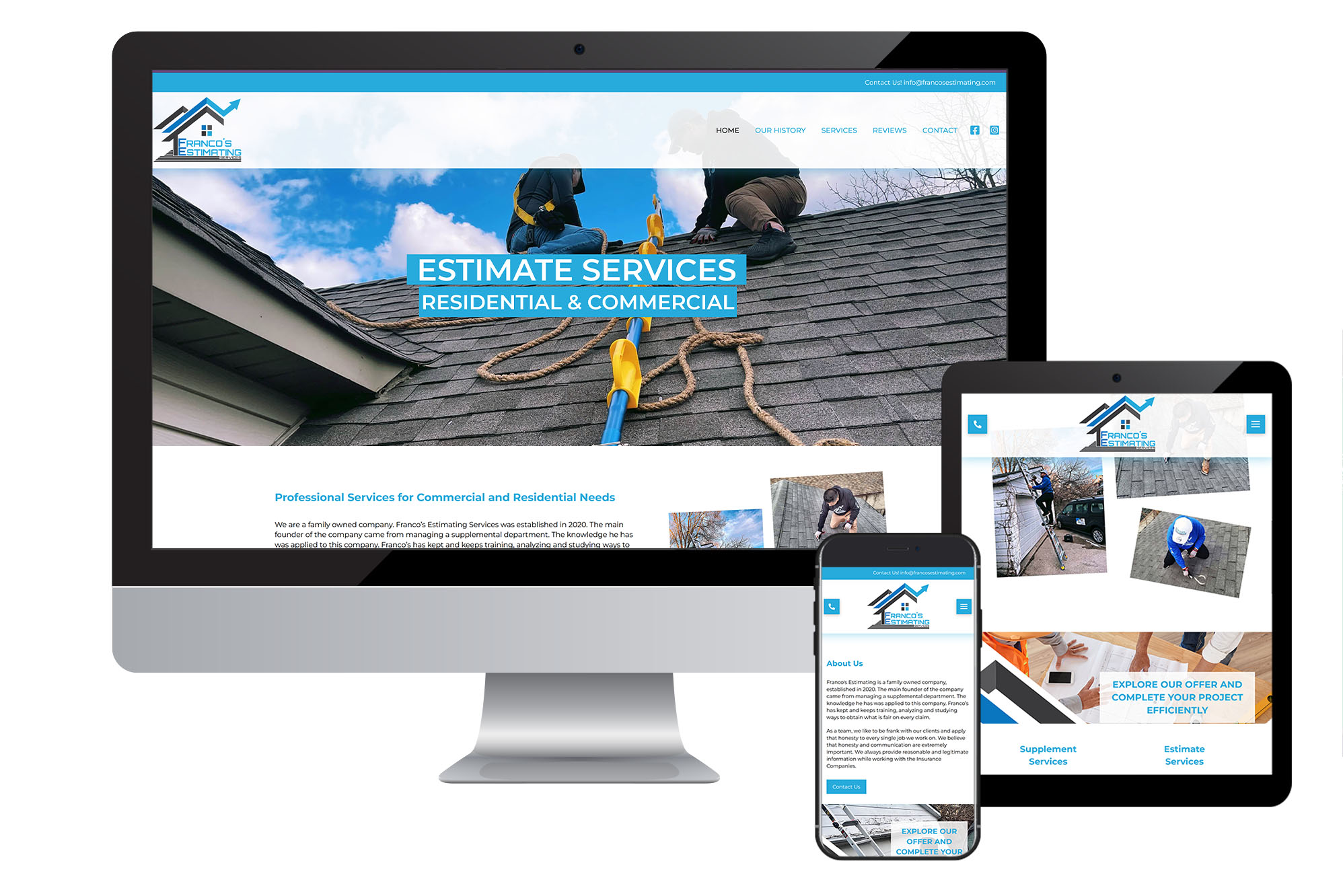
RESPONSIVE WEBSITE PROJECT WITH FOCUS ON CERTAIN USER EXPERIENCE.
Web Design
After getting all details and information from the owner of the company I made a research to be able to compare similar businesses and their websites. After getting a summary, I talked with the owner and presented him a brief idea how the website may look and what to include. He provided me with all the text content. I made a sketch on paper to show how the design is going to go, and after approval I started to work on the website. I also used Word Press platform and Themeco ProTheme Theme, so the work went smoothly. I made a desktop version, which was smoothly resized to tablet and mobile version thanks to the theme features.
Website design required creation of custom graphic elements that were used on the website. I basically used logo elements and photos found online in libraries like Adobe Stock or Freepik. I added and connected elements that the owner requested and wanted to implement to a website.
UX GOOGLE CERTIFICATE CASE STUDIES
GROCERY STORE APP DESIGN
My Role in Project
UX DESIGNER: User research, wire-framing, prototyping, app hand-off.
About
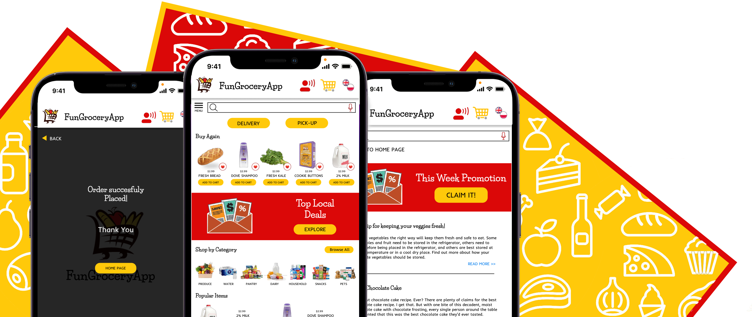
FunGroceryApp is a local store grocery shopping app that allows to order products for delivery or pickup. It targets people who are busy with their life and don’t have time to get good quality grocery products, as well as Polish immigrants who don’t feel comfortable making the shopping in person because their language barrier.
Main Problem and Goal
The main problem was a language translation feature that many of the people I interacted with wanted to have in their grocery app. Also, access to high quality local products was one of the main wishes that I met while preparing the app. The goal was to create a grocery application that gives a translation feature as well as access to wide variety of categorized products.
Main User Pain Points
Time: Users don’t have time to go for regular grocery shopping trips to get all the products they need for themselves or/and their families.
Stock Variety: Users find existing apps and websites they know and tried to use not stocked enough, they wish to have more varieties of products available to choose.
Accessibility: Some of the apps and websites are difficult to navigate or don’t have all options clearly described. They also rarely have solutions for people with special needs.
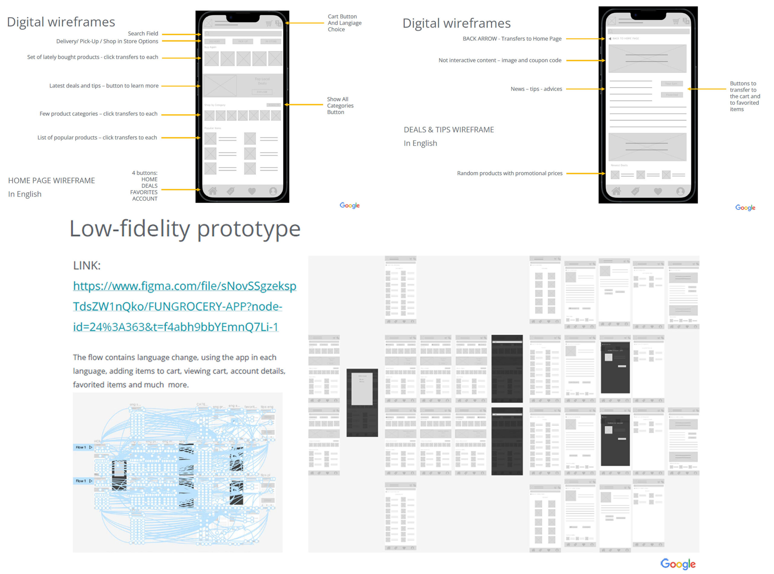
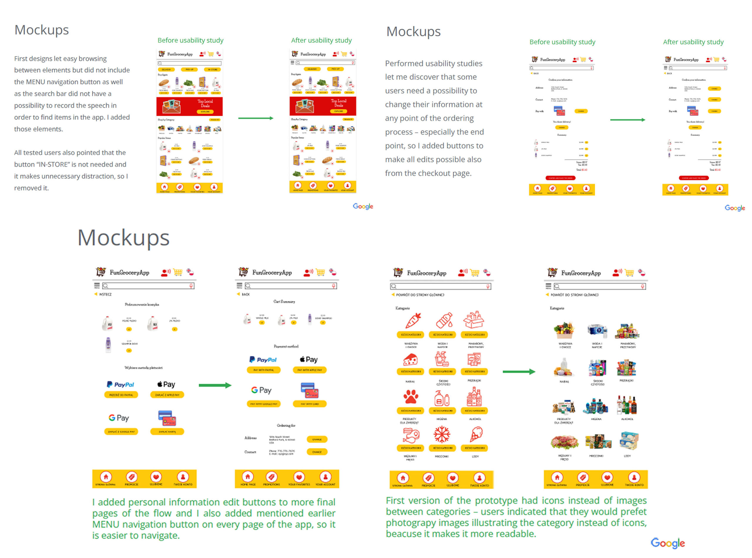
User Research
I conducted interview research with a couple of people in different ages and in different life situations. After that I created empathy maps to help me understand their needs and pain points that keep repeating and that keep them from getting the solution they need. My primary group of people are young adults, starting their lives in a chosen career, living by themselves, with a partner or their families, too busy to find enough time for regular grocery shopping trips.
The main problem that the users have is not being able to find one reliable website online grocery store which provides comfortable delivery or pick up options and that have enough different product choices.
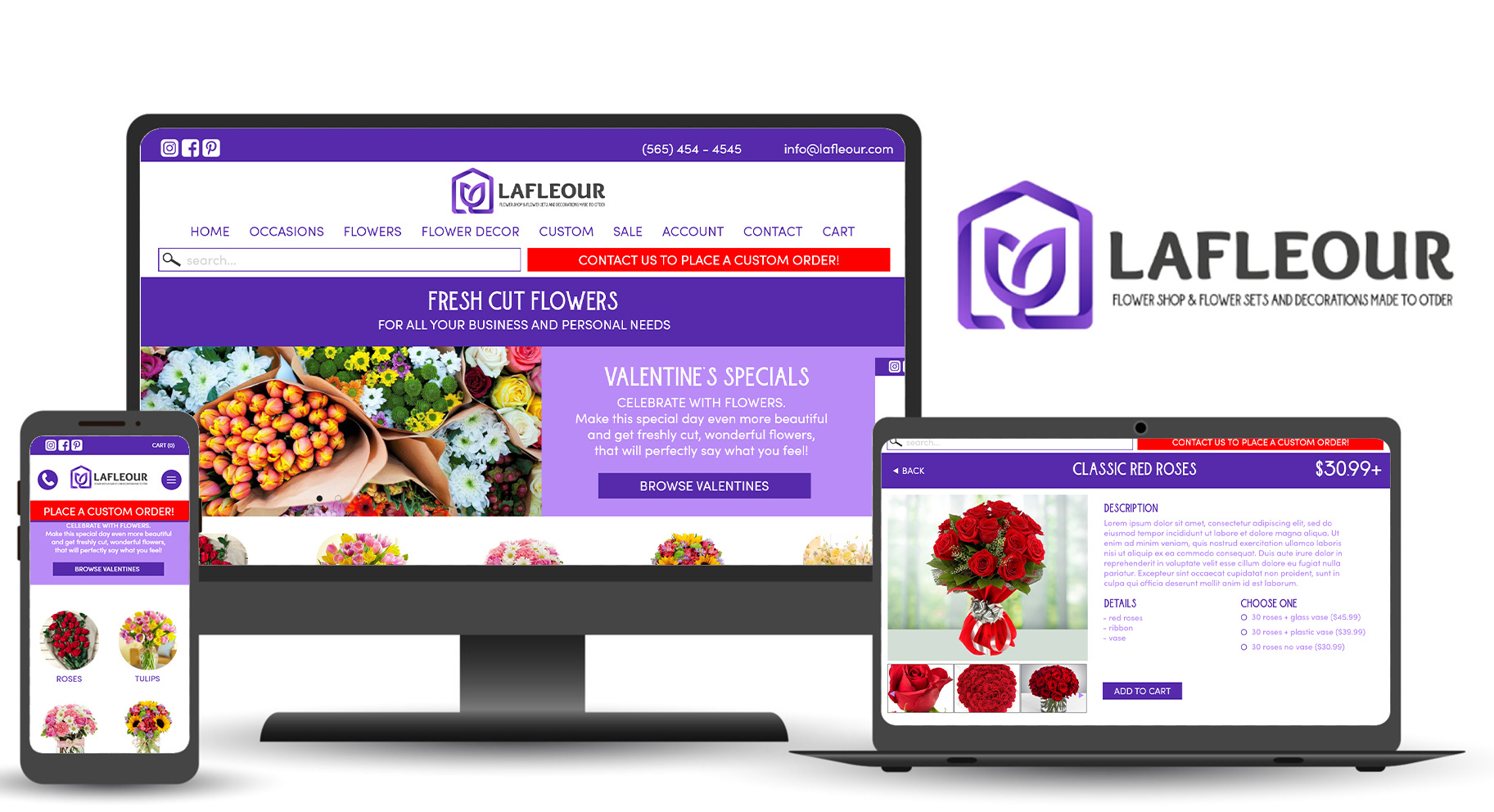
ONLINE FLOWER SHOP RESPONSIVE DESIGN
My Role in Project
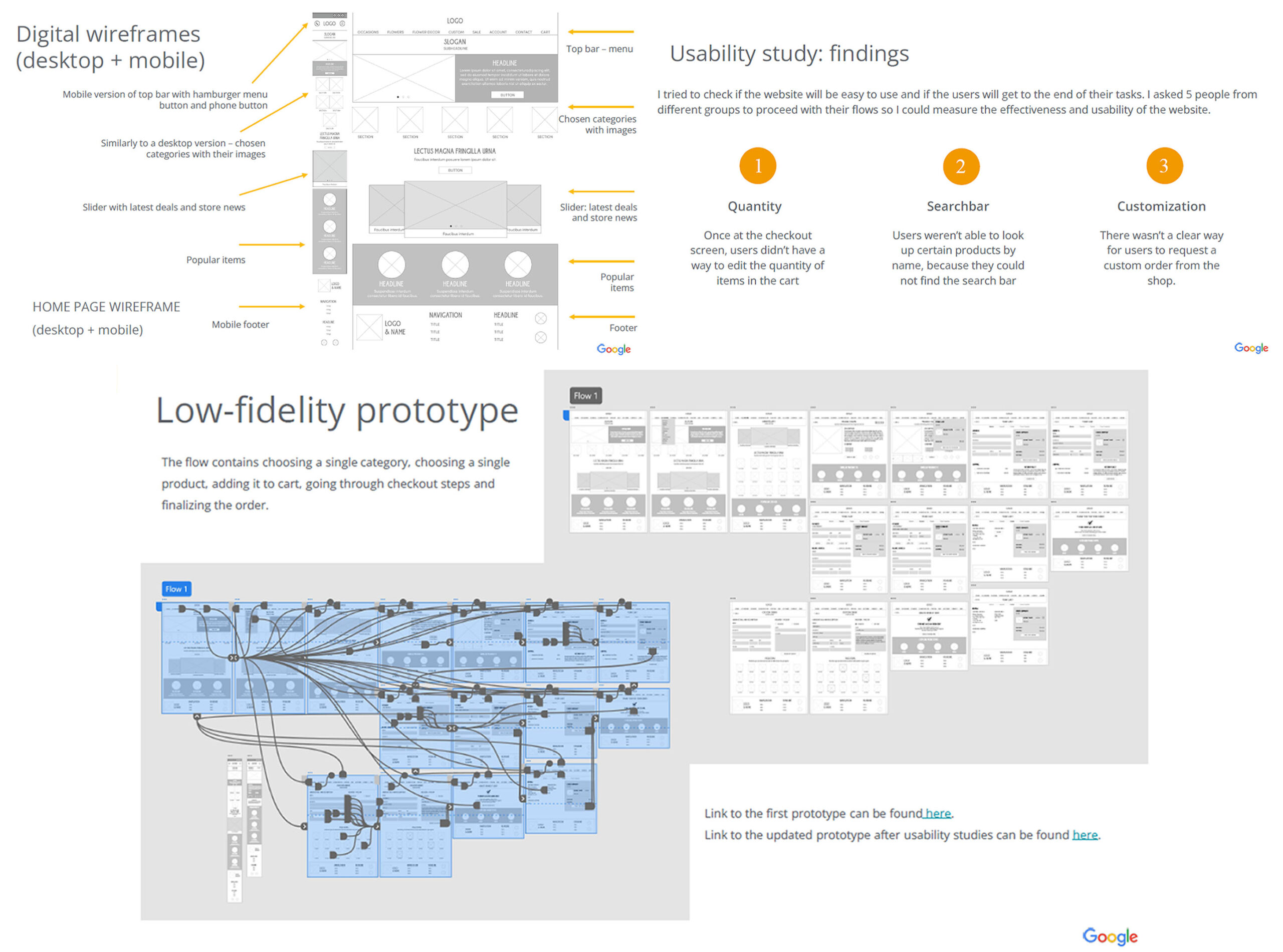
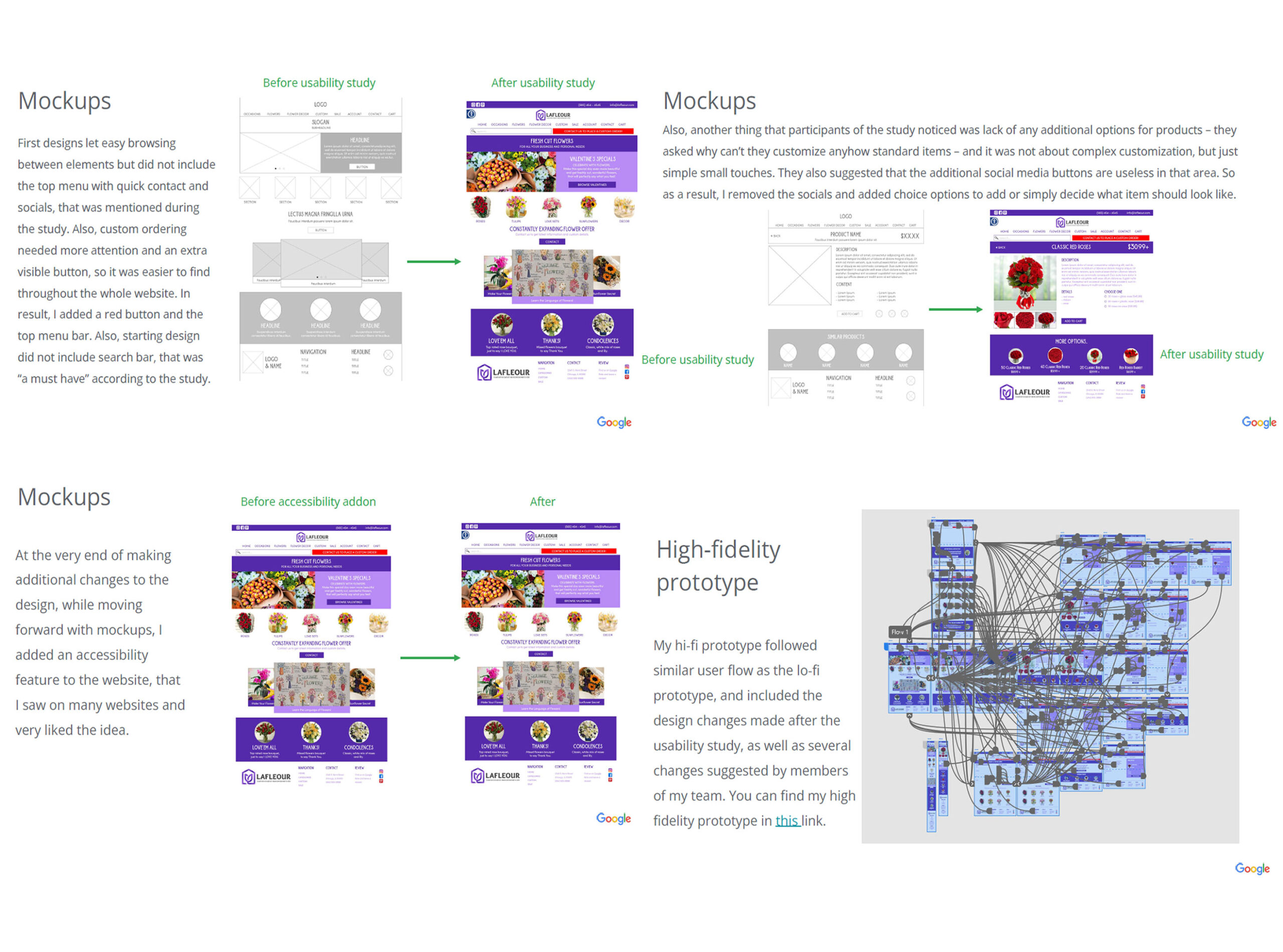
UX DESIGNER: User research, wire-framing, prototyping, app hand-off. I was responsible for conducting interviews, paper and digital wireframing, low and high-fidelity prototyping, conducting usability studies, accounting for accessibility, iterating on designs and responsive design.
About
LaFleouris a flower shop with possibility to order flowers and decorations ahead via online e-shop. It also allows customers placing custom orders, for big amounts of items, but also for unusual items, that are not available daily.
Main Problem and Goal
The main problem was a language translation feature that many of the people I interacted with wanted to have in their grocery app. Also, access to high quality local products was one of the main wishes that I met while preparing the app. The goal was to create a well working flower shop with possibility to order custom flowers and floral decorations ahead of time, so they can be picked up at a desired time.
Main User Pain Points
Time: Users don’t have time to waste on visiting many different flower places to get what they need, so they would like to have an option to purchase and order all they need in one place, with a possibility to customize certain items.
Stock Variety: Users find existing apps and websites they know and tried to use not stocked enough, they wish to have more varieties of products available to choose from.
Accessibility: Some of the apps and websites are difficult to navigate or don’t have all options clearly described. They also rarely have solutions for people with special needs.
User Research
I conducted interview research with a couple of people in different ages and in different life situations. After that I created empathy maps to help me understand their needs and pain points that keep repeating and that keep them from getting the solution they need. My primary group of people are young adults, starting their lives in a chosen career, living by themselves, with a partner or their families, having a need of regular flower purchases for business needs or personal needs.
The main problem that the users have is not being able to find one reliable website where they can customize their order and place it ahead, also request custom flower types and decorations, ready to be picked up or delivered at certain, chosen time and date.
PERSONALIZED GIFTS
Have no idea what to give as a gift? Let me help you! Unique gift ideas tailored to your needs!
- Caricatures
- Portraits
- Family Drawings
- Paintings
- Shirts, Mugs and Stickers
And more!
DIGITAL ART
World likes digital stuff nowadays. Want some detailed and custom made drawings or other art? Let me know! High quality, decent prices and endless possibilities of usage.
- Commercial Drawings
- Making a vector graphic
- Printable, big sized drawings (Wacom Tablet)
And more!
DESIGN
From simple business cards to outstanding posters and websites. Let me help you grow your business with beautiful designs!
- Promotional Graphic (flyers, postcards, banners)
- Business Cards
- Logo Design
- Web Design
And more!